Friday 30 August 2013

G[r]eek alphabet : F is in progress!

So what colour is a Feegle? What colour is his kilt? And what kind of beak does a Flamingo have? These are some of the many questions I ask myself when making things.

I had some pale felt, lotsa turquoisy fabric like the back of letter A, and navy and various patterned fabric in various shades and some dark royal blue. I really wasn't sure so I consulted a friend who loves Pratchett and may have dressed as a kelda. She was bound to have a final view on the colour of woad that the feegles have tattooed every inch of skin with. She voted royal blue. Which was cool as I also liked it, but difficult cos it frays really easily, specially on a small piece of fabric. I didn't have an orange for the hair I liked so that was going to be embroidery.

I dithered about the kilt as I didn't have any real tartan but then I found THIS picture
A slightly rude feegle in a red kilt - fan art
and thought YES! Reddish would work, specially as I'm going to have a red letter F.

Here's a picture of the first layer sewn down.

First layer of sewing fixed - the flamingo and the feegle body and kilt
Sorry it's dark but my phone is amping the yellow. The flamingo is pinker than that.

So then I have to place the F before I can finish the flamingo (so I don't embroider bits you won't see). I also need to do the hair and legs on the feegle.

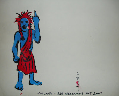
The most observant might realise - I've accidentally cut out the feegle the wrong way round - the original drawing had the other arm waving.
The original design for F for feegle and flamingo to show the switch in stance on the feegle. In one, the left arm is up, in the other, the right arm is waving.

But I'm not too fussed about it.

So then I have a slight hitch when I test pin the F ribbon. The small bar of the middle of the F is hiding a lot of flamingo. And this is starting to look crowded even without the feegle's hair and legs.

Test pinning of the ribbon of the F - with a fat small crossbar (hides a lot of flamingo and crowds the design)

In theory all my letter designs use equal-ish sized bars for all parts of each letter, but I'm not bound to it, each letter square is its own thing as far as I'm concerned. I just like some consistency-ish-ness (yes that's a word, I made it up right now so I know!).

Here's a temp look at what that might mean. Yup I think it's going to have to be halved.

Test pinning the F with a thin crossbar (makes more space in the design)

And what about G for Ghostbusters?

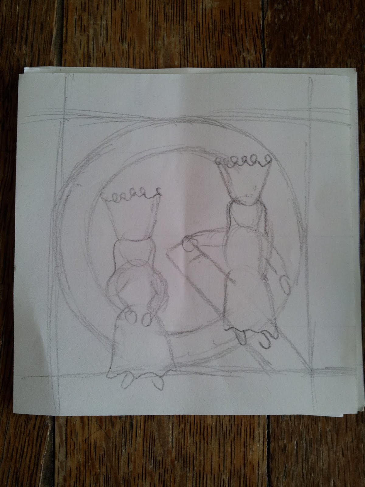
I did some colour sketches as I couldn't work out how to make the letter G clear and keep the Ghostbusters logo combo. Since I was at work I got two opinions and found a solution!


This top half shows the problem if I keep the whole of the Ghostbusters logo and the G and keep them both red. It's hard to read the G.

The bottom half saw me try making the G green. Not a bad solution but not quite there.

Colour sketches for G for Ghostbusters. Red G is hidden in the red logo, Green G is not quite right

So then I tried it in blue, also a bust (see top of the next sketch page. So I thought about using the contrast colour on the bit between the start  and end of the G's semi circle.

Then my friend says - why not leave that bit of the logo out. And, to make the G separate from the cross bar, have a thick black line round part of the G.

Colour sketches 2 for the G is for Ghostbusters. Blue G doesn't work. Switching and having red g with green logo is weird, so why not just have the G as the logo with crossbar?

And voila! Problem solved. Should be a quickie too as I'm going all felty on that one I think.
Final colour sketch for G is for GHostbusters

All this makes me realise the art debt to my family. My embroidery thread collection is I suppose you could say an inheritance from my grandmother. Embroidery was something I did for her too to make a gift - antimacassars. Sewing is something my mum still does, although no applique, mostly skirts and jackets.

And my Dad? My Dad does full size sketches of his paintings, then transfers them onto the white boards he paints on.

He also does colour sketches to work out colour combinations and balances. Sometimes as a kid he'd let me suggest colours and show me how they could look.

I guess I learn a lot and they weren't even teaching me.

Dear family, I love you a lot, even the deceased members.

Thursday 29 August 2013

G[r]eek Alphabet : E is for Elmo!

Elmo has to be one of the easiest letters to do. I could I suppose have chosen to make him out of woven cloth rather than felt but in this case, with him being a fuzzy character it seemed like a good fit to have him made of felt, rather than a lazy cop out.

It went by very easily. I did debate the nose colour a bit, firstly I'd forgotten what colour it is.

This was my reference image for that.
Photo of an Elmo doll or puppet
But because the background is orangey yellow, and his nose is orangey yellow I was worried it would make a hole through the image and tried various yellows paler or less red, but in the end orangey yellow was the best colour so I went ahead.


I struggled a bit with the embroidery on the eyes because I did rather tiny white stitches and then did the black over the top which made it difficult to sew through to make the eyes.


E is for Elmo (geeky alphabet) made out of cloth and felt

But all in all it worked out great and was over too quick to really stop and take photos of the stages.

I'm now on to cloth choices for F!!! Which means we're on to the second row full throttle!!

Monday 26 August 2013

G[r]eek Alphabet : D is for Dalek

Too tired for more than a few pics - will update with text later.

Updated 27/08/2013

D for Dalek was one of the relatively easy ones, Less different fabrics and I decided relatively quickly that the letter D would be made of the dark blue ribbon I had lying around. It was a little thin so in some places I did two rows.

Because the dalek has quite a lot of fine detail I decided rather than try to cut certain parts out of cloth - e.g the eye stalk and arms, I would just do them in embroidery.

I'd traced a dalek to make it look right in my design (free hand didn't work too well) so then I set out to try and copy all the details through from the back.

The major colour choices here were about the colour embroidery thread to use.

I didn't entirely use one image to decide but there was some borrowing of ideas from this image

Sample image of a bronze-y gold-y dalek...yes I know I have no clue what version it is or what it's called.

One of the things that immediately got away from me was that although thread can be about the same width as a pen line, it's not so easy to control and so I ended up with two rows of the hemispheres and deciding the rest were hidden by the D. I also ended up simplifying some of the design around the middle and neck and head.

Early stages of sewing d for dalek. I've started some of the yellow sewing of hemispheres but also the arms, grey outlined in black


Another part that became obvious was that unless I wanted to choose a very dark grey, I was going to need to outline in part the arms and later the eye stalk in black to make it more obvious against the red and blue. In addition the arm and the eye stalk went across both red and blue which broke them up, so I had to fill in with grey in a way I'd not originally planned.

All in all it came out OK I think. The final shot includes my hand to show you quite how small he his and how hard it is to sew something quite that small.

Finished D for dalek with my hand for size reference. The whole square is about 12cm squared.

Saturday 24 August 2013

G[r]eek update the second - now finished letter C, onwards and upwards!

Hi everyone,

Thought as part of updating I would start showing you bits of the process of making the letter.

First stage is trying to plan out all the major fabric colours so all the letters will fit together, particularly the base fabric, but also any other major colours in the picture.

They're laid out more or less where they'll be eventually but the areas covered are obviously larger since the fabric isn't cut out.

All the letter designs laid out on the floor in the arrangement they will be in at the final point, with chosen fabrics underneath

All the major fabrics laid out on the floor in the arrangement they will be in at the final point to assess the pattern of colours
There are some colours that I can't really alter - e.g. Elmo must be red, Big bird has to be yellow, the unicorn (pretty much) has to be white). Other colours I can be flexible with.

Once that's done I started cutting out the front's background fabrics the right size (I'd already done the back plain fabric and two layers of interfacing to stiffen the square).

I could do these letters in any order, and when I did the cloth book I did do them in any order, but as a librarian of about 9 years and library worker of about 11, I couldn't resist the urge to alphabetise the making.

Anyway, skipping to letter C:

Firstly I try and finalise any remaining decisions on fabric and colours. At this point I have not chosen what colours all the letters themselves will be so this is the first thing I try to decide. Then if there are any other fabric colours/choices I go on to them. I also debate about whether a details will be fabric or embroidered. Embroidery is easier but if it's a large area, it can take ages. I'm not very patient.

Letter C I already knew that it was a green background and that the cat would be fading out using gauze from a very orangey yellow.

I really wasn't sure what colour letter to choose so I asked my mum about colours and she reminded me about that thing they teach you in primary school (oops) - the colour wheel.
colour wheel - that's right, with a U. Because I'm English darn it and that's how we spell colour.
From that we talked about choices and I finally came up with purple because it looked like the purple I had would be complementary with yellow and OK with the green (yes really).

So on to cutting out the top layers of fabric. I make templates and then draw them on and cut them out :

The different parts cut out with the pattern pieces I used to do the cutting
 The trouble with purple is I have no ribbon, so it's insane folding and pinning time

Pinning the purple fabric of the letter C so it can be hemmed onto the backing fabric
I then have to carefully think what gets sewn first. In this case, the letter goes on first and then the teeth of the cheshire cat, then the gauze of the fading cheshire half face, then the yellow of the currently present, then the nose.

I can't always draw on the base fabric either because it might show or because it's too dark to pick it up, so instead I trace the design onto one of the sheets of interfacing (stiffening material used in collars etc). I trace it through the right way, and then the reverse as once it's pinned in place I can only see the reverse.

Image showing original drawing and the traced plan on the interfacing material (stiffening material)
This is the interfacing pinned in place.

Interfacing pinned onto the background fabric, showing the reverse traced design to help with pinning on the front.

There are no inbetween shots for this one as I got anxious early on and wasn't sure it would be OK.

Looks pretty darn OK to me I think
Finished letter C! C is for Cheshire cat


Wednesday 21 August 2013

G[r]eek alphabet - update have started making and designs are finalised for X and Z!

So I finally decided on some designs for X and Z. Also I needed a second H and 2 more Os. I've designed one of those but not the other.

X is for Xena (warrior princess)

New design for geeky letter X with Xena warrior princess

Z is for Zaphod Beeblebrox (Douglas Adams, Hitch Hiker's guide)

New design for geeky letter Z with Zaphod Beeblebrox (Douglas Adams Hitchikers guide)

Extra H is for Horus (hieroglyph of eye of Horus)

Extra letter H with eye of Horus (Geeky alphabet)

Extra O is for Odysseus

Exrtra letter O with a Greek Ship for Odysseus (geeky alphabet)

Designs start to come to life - A and B both finished

A is for Athena and Apples of the Hesperides - almost there sewn in fabric
An early stage of making letter B is for Big bird and books - pinning the ribbon and other pieces
B is for Big Bird and Books sewn in fabric


I officially LOVE ribbon (way less hemming) and Interfacing - it's like tracing paper only you can sew with it (more on that later in pictures)

Sunday 18 August 2013

G[r]eek Alphabet - V to ?Z

V is for vampire...who likes to count

Original sketch
Original sketch for geeky letter V for violin (Sherlock Holmes)
New sketch
New sketch for geeky letter V for vampire (the count from Sesame street)

So I had struggled with V the last time round and had overlooked my friend's suggestion from the last time of vampires - the Count from Sesame Street. I had ended up with "violin" - a reference to Sherlock Holmes' instrument of choice. This was a bit of a stretch really as yes, Holmes does play violin but it's not really iconic in the way that say, the sonic screwdriver is for the Doctor.
So I was kindly reminded of this idea again while faffing with the new sketch and so voila! New design with the Count. I confess at this point - entirely traced from the internets but hey! I'm going to be the one sewing it darn it!!

W is for Wonderwoman

Original sketch
Original sketch for geeky letter W for Wizzard (his hat - Rincewind's spelling - Pratchett)
New sketch attempt 1
First attempt at new sketch for geeky letter W for wizzard (his hat - Rincewind spelling - Pratchett)
New sketch attempt 2
Second attempt at new sketch for geeky letter W for Wonderwoman
When I'd originally sketched for the letter W I had not included the W in the sketch, except as it was part of the writing "Wizzard" on the hat, misspelled in the same fashion that Rincewind apparently does on his own hat in Pratchett's stories about him. When I came to combine the hat with the letter W on my new sketch I struggled to fit that hat in such a way that I could clearly write the word Wizzard on it. I had thought of White rabbit but somehow I still felt a bit uncertain about it. Should it go under W for white or R for rabbit? Combined with the fact I was starting to feel there was an imbalance of women to men on my letters, I decided to go to Wonder Woman, an idea I'd avoided early on because well, comics are not a big thing in her life, even if they have been in mine but...heck. WONDER WOMAN so who cares? And tadah! I looked for a reference image for the face and discovered her head band is kind of slightly different in different pictures. But this is the image I liked
 Image from DC comics of Wonder Woman's face 
So then I got to thinking about the gauntlets/bracelets which I'd always imagined as plain. This mostly seems to be the case, although some have stars and other patterns. So I'm keeping it simple.

X is for ....I don't know

No I am not kidding. I did an original sketch for X
 But it turns out X wings from Star Wars are kinda....only vaguely X ish. Specially when you want your X to be more symmetrical from multi directions.


Think this is fan art of Luke Skywalker's X wing
I could overlay one on the other, but it would start to get messy, and I could make it small but it would become too fiddly... So where do I go next? I'm not sure...but I have already sketched some ideas for Y and Z so onwards!

Y is for Yggdrasil

...but then you knew that from my earlier posting.
Original sketch
Original sketch for geeky Y for Yggdrasil (the world tree, Norse mythology)


So I was trying to keep things simply but Yggdrasil is the world tree - at its simplest an Ash tree. Not very complex but then I read the Wikipedia article and the Encyclopaedia Mythica article
and I'm like. Right so symbols related to the tree -
  • It has three roots that lead to three sources of water:
    • the Well of Wisdom (MĂ­misbrunnr)
    • the Well of Fate (Urdarbrunnr)
    • the Hvergelmir (Roaring Kettle), the source of many rivers
  • There is a dragon/snake eating its roots called Nidhogg
  • There is a squirrel in its branches called Ratatosk
  • Four deer representing the four winds
  • an eagle
I started thinking and found this picture I like, which is a tattoo design.
Tattoo design of Yggdrasil

So what's a girl to do? I can't fit all that in! But but but but....  squirrels! And deer!
New sketch for geeky letter Y is for Yggdrasil the world tree


Z is for ?Zeus

Original sketch 
Original sketch for geeky letter Z for Zeus

I did an intial sketch for Z of Zeus - a beardy guy with Lightning. I'm still thinking though as it would push the balance in favour of men over women, and also apart from the lightning, not very thrilling. New sketch is not yet done. I will update you when I've done some more!

G[r]eek alphabet - S to U

S is for stars

Original sketch
Original sketch for geek S including Star Trek and Sonic screw driver
New sketch
New sketch for geeky s with Stars - constellation of Ursa Major / the plough

It turns out sonic screw drivers are hard to draw and have to be specific to the correct Doctor. I didn't really like the placement of the Star Trek symbol and anyway, although she likes Star Trek, she's not really a superfan.
So this time round having removed the stars from the letter C, I decided I wanted at least one starry night sky letter and went with putting stars here. It means I get to keep the Ursa Major (Callisto) yay! Also it's one of the most familiar constellations to many and you can use it to find the north star.

T is for Tardis and towels

Original sketch
Original sketch for geeky T for Tardis and towel
New sketch
New sketch for geeky T for Tardis and towel

Not much change here - Tardis has grown and towel is now striped. I'm debating hunting for a scrap of actual towelling to use. What's the towel about? Douglas Adams Hitchhiker's Guide to the Galaxy reference. You should ALWAYS know where your towel is. Also, don't panic.

U is for Unicorn

Original sketch
Original sketch for geeky U for Unicorn
New sketch
New sketch for geeky U for Unicorn

Main difference is an improvement in the unicorn's horsey-ness, thanks to my Dad's drawing input. Phew. I can't draw horses. Or much of other things but my horses are not very horsey. I did consider Uhura but with my drawing skills she'd be a black woman in a red mini dress and as mentioned, not entirely relevant for a non-superfan.

G[r]eek Alphabet - P to R

P is for Persephone

Original sketch
Original sketch for geeky P for pomegranate and Persephone
New sketch
New sketch for geeky P for pomegranate

I always wanted to have a Persephone reference but as I mentioned in an earlier post, there's nothing distinctive about Persephone. I did have her disappearing off picture originally but I decided in the interest of simplicity it wasn't really much use just to have a skirt and foot in the picture.
The pomegranate has also moved as I liked the idea of matching the curve of the fruit and the curve of the letter P.

Q is for Queens

Original sketch
New sketch

No real changes to comment on here.

R is for R2D2

Original sketch

Original sketch for geeky letter R for (white) rabbit
New sketch attempt 1
New sketch attempt 2
 Second attempt at a new sketch for geeky letter R for R2D2 on his own

So as you can see a variety of revisions have happened. The first thing I should admit is my original sketches at first accidentally missed out the letter R. No idea how that happened but hey. When did draw it I was dithering and uncertain what to put in it. I had thought of the Red Queen, but Q is a tough letter, so Queens (red and white) ended up in Q. And so I meandered into (White) Rabbit from Alice in Wonderland. Something I'm fond of but seemed a bit of stretch. Turning to the new sketch I'd forgotten my old sketch and had R2D2 suggested/reminded to me. Then I got onto the track of Ra the sun god. And then as we described for the letter H for Heracles, I got the wrong symbol. This is Horus' symbol.
So this fitted nicely with the fact I felt R2 was too small anyway and too fiddly to sew. And so we end up with design 2 - hurrah!