Due to the proliferation of posts about what is essentially one object in parts, here is a guide to all the stages.
In short, this is my second book made of cloth, based on a German nursery rhyme taught to me by my grandmother.
Saturday, 30 January 2016
Page 5 - remembering things passed
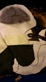
At this point I started to think about the eventual compilation of all the pages and realised something I thought I'd planned for earlier - if I used the pages as is, pages 5 and 6 were going to be back to back.
This was not at all what I'd hoped for. My aim was for pages 5 and 6 to be a double page spread, with the Oma (grandma) on one page talking to the child on the opposite page who is responding to her question. I did not at all want for them to be back to back with each other.


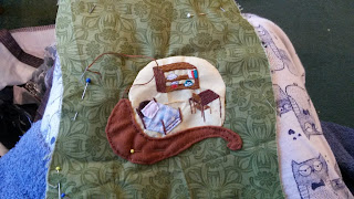
This particular page is important to me because it includes a sort of homage to my own Oma, because she was the one who taught me this nursery rhyme and because I love her.
Despite the fact the fabrics were not super stretchy for some reason when I cut the speech bubble out and then pinned it on, it strangely shrunk. I'm not sure how obvious this is from the reverse.
It meant I shifted the writing slightly to fit in the smaller space. You can also see that the head of the Oma move slightly and the feet moved up although on the whole it is more or less in place as I planned.
You can also see that things have got kind of bumpy at the back. Again, not entirely sure how this happened except I probably should have put in more pins.

However, from the front everything has worked out looking OK. You can see below that the page is a bit bumpy but looks fine. I had intended her whole chair to be applique but the fabric chosen was too thick to use for the arm of the chair on the right so I tidied up some of the details with embroidery instead.

When I sew I like to "watch" tv, by which I mean listen with some peripheral watching and occassional looking up. Podcasts also go down well. For this particular page, I did a lot of the sewing of the Oma while listening to the recorded google hangouts for Vaginal Fantasy Romance Book Club.
This records the last of catch up as I've barely started the next page. I have a few more making of pics to add in to the blog but there will be at least a brief interruption before [not very] regularly scheduled programming returns.
Page 4 - smell the flowers
This is perhaps one of the simplest concepts yet, I couldn't think of another way to play with the concept of butterfly wings except to make them flapping or above the page.
As a result I didn't take a lot of pictures of the progress.
Again fabric created the main complication. The wings are made from a stretchy fabric I think meant for swim suits. I used it on the cover of a previous book.
Another problem I'd not thought through was the fact that with a very pale yellow cotton sheet background, the design on the back would show through. Normally this wouldn't be an issue as it would be covered up by the appliqued fabric, but in this instance, I realised after making my butterfly that because the wings were free of the back, you'd be able to see the design underneath. I didn't really want this, so I chose a really low hassle solution - red felt, of which I have a lot due to not being able to buy in a small quantity.
I made a flower shape and sewed it over the design I wanted hidden and embroidered some petal edges to hide what remained visible of the design. The flower is actually slightly loose from the back fabric, having been sewn down in a circle near the centre but will lay flat on the page so should do a good job of covering up the design.
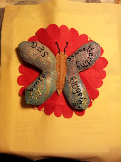
I decided to put some padding in the wings which has given them a bit of a cuddly appearance but I'm quite happy with it all the same. Due to the fatness of the wings, I also ended up making the head and the end part of the body free from the cloth as it worked better that way.
On to the next page!
Page - 3, really not that naughty
In the UK page 3 typically refers to the fact that the Sun has a topless model on its page 3 of the tabloid. Mine is a lot more decorous, involving a sparrow and a biplane rather than anything else.
As always I was looking at a fun way to reinterpret something pretty basic. Please don't ask how feathers connect to a biplane. It's just the way my mind worked.
The biggest challenge here was the fabrics. The basic background fabric was actually multiple layers of a very transparent cloth, and the plane was made out of some extremely stretchy fabric.
It rapidly drove me a little distracted as you had to hold it in place and there's a limit to the number of pins you can use on something so small, specially as the pins at the edges are just where you want to sew.
 I really regretted not putting interfacing onto the plane which would have helped a lot in keeping its shape.
One of the other problems I face is that I don't own infinite colours of thread. When is started sewing down the plane I'd found what I thought was the nearest colour I had. I then found I had something much closer, so I sewed over the top to hide the other colour stitching
I then used a brown to create shadows and details. However, as you can see here the brown X of the wing behind the brown sparrow, even though they are different browns was too indistinct.
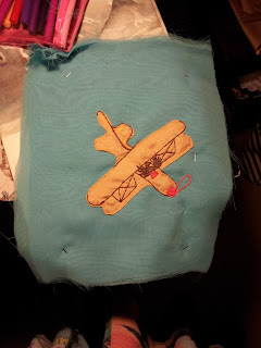 So, having used red for the propeller and the cockpit I added a bit of red to the Xs on the wings to make them more of a contrast with the sparrow.
The final problem I had was that the fabric seemed to be fraying at a rate of knots. So to prevent the fabric from disappearing I sewed ribbons over the edges to hem them .
The final page - "Der sperling feine federline" - the sparrow has fine feathers.
 For interest I was watching a lot of Jessica Jones while making this page.
As always I was looking at a fun way to reinterpret something pretty basic. Please don't ask how feathers connect to a biplane. It's just the way my mind worked.
The biggest challenge here was the fabrics. The basic background fabric was actually multiple layers of a very transparent cloth, and the plane was made out of some extremely stretchy fabric.
It rapidly drove me a little distracted as you had to hold it in place and there's a limit to the number of pins you can use on something so small, specially as the pins at the edges are just where you want to sew.

One of the other problems I face is that I don't own infinite colours of thread. When is started sewing down the plane I'd found what I thought was the nearest colour I had. I then found I had something much closer, so I sewed over the top to hide the other colour stitching
I then used a brown to create shadows and details. However, as you can see here the brown X of the wing behind the brown sparrow, even though they are different browns was too indistinct.

The final problem I had was that the fabric seemed to be fraying at a rate of knots. So to prevent the fabric from disappearing I sewed ribbons over the edges to hem them .
The final page - "Der sperling feine federline" - the sparrow has fine feathers.

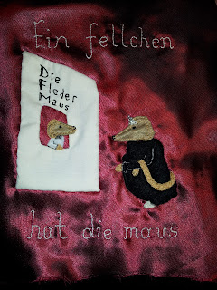
Page 2 - drunkeness and debauchery....maybe not
I may have been slightly tipsy when I started work on this page, and this may have been the cause of my initial mistake, although to be honest I'm entirely capable of making a mistake without combining alcohol and sewing.
I chose red for the basic colour of this page because it reminded me of theatres I've been to. I'm not sure which one in particular but somehow it said "theatre" to me.
First thing was to sew down the large white area of the box office, then I sewed down the head of the ticket seller and the mouse attending the opera.
This is when I made my big mistake, I placed the body of the mouse on the sheet from the front thinking I'd got it right or maybe I placed it while flipping from back to front, who knows now, I was tipsy, and I sewed down at high speed the furcoat of the mouse attending the opera. Having finished, I flipped over to see the following : the furcoat was on upside down.
 Any sensible person would have undone the stitching and placed it again. I'm not that sensible, I'm also very lazy and fortunately for me the mouse's head was roughly equidistant from the top and the bottom meaning, as you can see below, the end result was the design ended up a mirror image of itself.
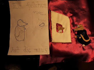 The only pain was resituating the writing on the reverse. Really all in all it was not a disaster, and although sometimes the design is meant to face a certain way, this isn't one of those designs. You may note that the words ticket office have disappeared, this is because it was just too small and I felt it was pretty obvious what was going on.
Photographing this page was its own challenge which I have not entirely solved. The fabric is satin-y. It means it reflects light all oddly when photographed in a way your eyes don't find problematic.
This photo is far too dark
 This one, taken in daylight, has some areas more close to the real colour, but others are just not.
 More pictures of more pages to come!
I chose red for the basic colour of this page because it reminded me of theatres I've been to. I'm not sure which one in particular but somehow it said "theatre" to me.
First thing was to sew down the large white area of the box office, then I sewed down the head of the ticket seller and the mouse attending the opera.
This is when I made my big mistake, I placed the body of the mouse on the sheet from the front thinking I'd got it right or maybe I placed it while flipping from back to front, who knows now, I was tipsy, and I sewed down at high speed the furcoat of the mouse attending the opera. Having finished, I flipped over to see the following : the furcoat was on upside down.


Photographing this page was its own challenge which I have not entirely solved. The fabric is satin-y. It means it reflects light all oddly when photographed in a way your eyes don't find problematic.
This photo is far too dark


Page 1 - a snail of a time
With each of these pages my aim is to add some interest to what is really a very simple thing.
I started by working on the most difficult and most interesting part of the design - the snail's shell. As the design often shifts from design to reality I often start with the bit that forms the central part of the design and which, if it moves, the rest of the design can move around.
I traced the outside of the shell onto interfacing. The interfacing is multipurpose. I wanted the flap of the shell to be a bit stiff and also as with the page, the interfacing gives me a way to trace the design onto the reverse of the fabric.
 When placement of the lettering is extra important I will often sew it from the back in running stitch as you can see here. In this part I have to be careful where the letters go so that they fit in a small space.
 I then go back and fill in the gaps from the front as you can see
 After that I started on the spiral.
 As you can see in my discussion of the book's design, I always planned to have an actual little house inside the snail's shell.
However, as I started work I decided it was no fun to have absolutely nothing on the inside of the flap and added in some more details to that part. I thought I'd put in an aga oven and some other bits.
I had planned to use some applique but it was just far too small so there is very little applique in the design. Just the pillow and the main part of the bed and the aga.
 Once these parts were all done, I sewed the back and the front of the flap together and turned it inside out and finished it off.
Then I sewed down the inside of the shell on the page, followed by the snail body.
 Despite
carefully tracing and cutting out the snail's body and shell the same
size as my design, there's been some shift in size. You can see this
from the back. Fortunately I'm really not picky about this so long as it doesn't look too awful. It's also not a big shift.
Despite
carefully tracing and cutting out the snail's body and shell the same
size as my design, there's been some shift in size. You can see this
from the back. Fortunately I'm really not picky about this so long as it doesn't look too awful. It's also not a big shift.
 I then sewed the flap onto the page and we're done.
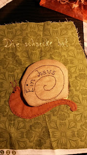
This is the completed page with the snail shell closed. The page text reads "Die schneke hat ein haus" - the snail has a house.
 Here you can see the inside of the shell with the flap open. The completed aga, a little hand towel and some kitchen implements hanging up.
 I've actually completed quite a few pages so I'm going to separate each page into a separate blog post just to avoid picture overload. I may add in a few more making of photos when I'm back at home.
I started by working on the most difficult and most interesting part of the design - the snail's shell. As the design often shifts from design to reality I often start with the bit that forms the central part of the design and which, if it moves, the rest of the design can move around.
I traced the outside of the shell onto interfacing. The interfacing is multipurpose. I wanted the flap of the shell to be a bit stiff and also as with the page, the interfacing gives me a way to trace the design onto the reverse of the fabric.
However, as I started work I decided it was no fun to have absolutely nothing on the inside of the flap and added in some more details to that part. I thought I'd put in an aga oven and some other bits.
I had planned to use some applique but it was just far too small so there is very little applique in the design. Just the pillow and the main part of the bed and the aga.
Then I sewed down the inside of the shell on the page, followed by the snail body.
This is the completed page with the snail shell closed. The page text reads "Die schneke hat ein haus" - the snail has a house.
Friday, 29 January 2016
It's been a long time, we shouldn't of left you
...without a dope beat to step to...
It appears I have not blogged since October. Good grief!
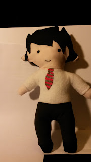
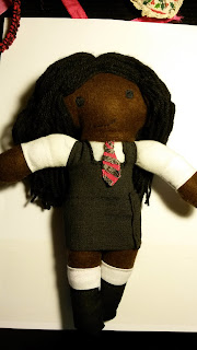
I'm going to throw you a few pics of some plushies I did a while back.
These two dolls are the school uniform of the children at the school a friend of mine who is a newly qualified teacher. Apart from aiming to get the details right, I decided early on, one of the girls would be black because most of my characters are white and there are plenty of kids at that school who aren't, also she was a sort of homage to one of my friend's daughters who is cute and adorable. I wanted the smile to be clear and her mouth disappeared for some reason with black thread on brown even though her eyes didn't so I gave it a small white line to make it stand out
My friend was very pleased so I'm glad they came out alright. She gave me a book token and some chocolate. Bless.

I also made a Furiosa doll for a friend. The tricky bit was the arm, which I made out of pipe cleaner. I'm not very patient so rather than going out to get the right colour I coloured in with felt pens the yellow pipe cleaner to make it dark metal grey.

Similarly for her oil slicked shorn head, I coloured in for a looong time the pink fabric for her head. I really wished I'd used embroider but that would have been equally long.
The basic doll was made first then I sewed on her metal arm.

My friend and customer was very happy.
I have got some update on the Nursery rhyme book. WITH PICTURES, of actual sewing done. But I'm too sleepy to do it now.
It appears I have not blogged since October. Good grief!
I'm going to throw you a few pics of some plushies I did a while back.
These two dolls are the school uniform of the children at the school a friend of mine who is a newly qualified teacher. Apart from aiming to get the details right, I decided early on, one of the girls would be black because most of my characters are white and there are plenty of kids at that school who aren't, also she was a sort of homage to one of my friend's daughters who is cute and adorable. I wanted the smile to be clear and her mouth disappeared for some reason with black thread on brown even though her eyes didn't so I gave it a small white line to make it stand out
My friend was very pleased so I'm glad they came out alright. She gave me a book token and some chocolate. Bless.


I also made a Furiosa doll for a friend. The tricky bit was the arm, which I made out of pipe cleaner. I'm not very patient so rather than going out to get the right colour I coloured in with felt pens the yellow pipe cleaner to make it dark metal grey.

Similarly for her oil slicked shorn head, I coloured in for a looong time the pink fabric for her head. I really wished I'd used embroider but that would have been equally long.

The basic doll was made first then I sewed on her metal arm.

My friend and customer was very happy.
I have got some update on the Nursery rhyme book. WITH PICTURES, of actual sewing done. But I'm too sleepy to do it now.
Subscribe to:
Posts (Atom)