Monday 11 November 2013

G[r]eek Alphabet - Z is for Zaphod Beeblebrox

I know what you're thinking. You're thinking poetryghost you're a LIBRARIAN, shouldn't that be B is for Beeblebrox, Zaphod. Actually you aren't cos only librarians think these kind of thoughts but never mind.

I'm not 100% well and to cheer myself up at being not able to go to dance class I thought I'd catch you up on letter Z.

Zaphod is a fun character - fond of clashing outfits but also a bit suave. I decided I would make the colours as extreme as possible but preferably not eyewateringly painful to look at.

I started with the peach background and then added green and purple, notoriously bad colours to wear together. To make it bearable I toned down the green and the purple was darker anyway. I dithered over the letter colour for a while but ended up with dark greenish to contrast everything else going on and to avoid adding more colours to the palette.

I did worry initially about the skin being a beige colour and fading into the peach background but I figured if I gave him brown hair on his heads then that would help to outline his heads

Z for Zaphod Beeblebrox initial sewing down of the main fabrics

So then I wanted a way to link the two halves of his shirt so that it didn't look like two guys hugging each other. So I created a zig zag across the edges using embroidery.

At this point the glass for his pan galatic gargle blaster was too dark on the dark of the green so I outlined it in white.
Z for Zaphod Beeblebrox, most of the embroidery done
I realised that the pale green was also fading into the background too much, so I decided that having outlined one green sleeve in purple I could outline the whole of the green side in purple as well. I also outlined all the flesh in a very thin black line.
Z for Zaphod Beeblebrox complete

So there we are Zaphod Beeblebrox is complete!

Final news before bed - letter A now has a completed back and is completely sewn up! Yay!!!!!!!!!!

Sunday 10 November 2013

I aten't dead

Alphabet News

Z is for what exactly?

I know what you're thinking, where the frak is the letter Z for Zaphod Beeblebrox and well, you'd be right I haven't posted it yet. Stuff happened and things, things also happened. I reassure you dear reader, I have completed Z. In fact I've completed another of the extra letters. As part of being considerate and maintaining my friend's privacy over her child, I have decided I won't be posting any of those letters up. Although it is doubtful anyone could guess their name and surname just from seeing 3 extra letters I don't wish to run that risk.

Overall project progress

Further news - I've finally got all the velcro I need for the sticking up, and have started working on the attachment. The fuzzy half of the velcro is pinned in place on the backing cloth and my lovely Mum has attached a pole to the top.

I've even started sewing on the first back of a letter. I decided I would die of boredom if I made all the backs at once and then sewed them all on. So I will be making one back at a time and then sewing it on one at a time. This means that the letter A is almost completely done, velcro and all!!!! Wooo!

New plushie on the horizon

So someone asked me to make a new plushie, and not any old plushie........it's....erm Loki from Thor and Avengers movie.

I'm simultaneously very yay and a bit argh! Panic!

Today I thought I'd start working out what needs to be made and in what colours, and as always I was bemused by costume variants both within movies and between movies.

Clearly he will have a helmet. With horns. Obviously.
But then there's
  • cape/no cape variants
  • armour/no armour
  • two different staves
    and
  • various shoulder pad combinations.

 Obviously my plushie will not be a perfect copy of any of these outfits. I'm not made of magic people!

Currently my plan is :
  • Basic body of plushie will have the tunic that sort of has a v cutout on the front
  • Coat with no sleeves over the top lined with green mid calf length
  • Cape attached to the coat with no sleeves in green

I can't work out if I will be putting the goldy armour on the coat or not but if I don't it will be quite dark. That's partly why I'm doing the cape. He wears a lot of black.

Anyhoo I will be asking my lovely friends who made a full scale femme version of the costume to help out and advise!

Links for reference

Loki cosplay tumblr
Loki cosplay photobucket picture refs

Thursday 17 October 2013

G[r]eek Alphabet - Y is for Yggdrasil

I've talked about this before but Yggdrasil is the world tree, a figure from Norse mythology.

This was going to be a composition with lots of greens and earth tones. I did debate whether to have a bright tree on a dark background or vice versa, but with some back up opinions I decided to stick with the dark tree on a slightly lighter background.

Colour test shot of a lighter and darker green fabric. Photo taken while I was debating whether the tree would be dark green on light green or the reverse

This following was testing out the colour for the letter Y (white) and the snake (greeny yellow).

I had looked up some deer pictures for colour reference but I decided that I needed a contrast and I couldn't face such fine hemming so I used some fake leather that wouldn't need hemming for both the tree and the deer.

Late colour testing including the cut out tree in a redder fake leather, the deer in a fake leather suede that is paler and more yellowy and the yellowy green of the snake to be, plus the white of the ribbon for the Y

Final debate was about the width of the letter Y. Mostly I've used this type of ribbon at full width but when I laid it over the tree, you couldn't see the tree either side.

Debating how thick a ribbon to use for the letter Y. The full width of the white ribbon felt too overpowering here
 So instead I decided I would use it half thickness.

Debating how thick a ribbon to use for the letter Y. The half width of the white ribbon felt more appropriate to the composition
 This is an early stage of sewing down. The tree is partially sewn down, the tree also, the deer are started sewing and the snake is in progress.
Part way through sewing down the design. Snake is half way done, tree is part sewn as are the deer.
 Snake completely sewn down, I'm on to the details! One of the things you can see from this picture to the next is that I've used embroidery to slightly tidy the outlines of the snake, specially at the head and tail. This was to smooth the outline which was hard to create while sewing down quite a thick snake.
Part way through sewing down the design fabrics, the snake fabric is now sewn down, although later additional details were embroidered on to finish him off
 One of the things I decided late on was that the slight leaves embroidery was too bright. I decided to over sew with darker colours to tone it down. The squirrel, part of the original design was debated a bit as to whether I wanted to include it in such a busy design, but I decided I wanted a squirrel so I put him in. The raven however, did not make the cut.

Y is for Yggdrasil the world tree complete

Mythology Spot


For more lovely info on the mythos of Yggdrasil try this great article Norse Mythology : Yggdrasil and the Well of Urd.

In summary of the details I've included.
  • The squirrel is Ratatosk - a messenger animal
  • The snake is probably Nidhogg, a snake who gnaws at the roots
  • The deer are two of the 4 that spend time in the tree. Their names are Dain, Dvalin, Duneyr, and Dyrathror. There wasn't room for 4 deer - sorry.

Saturday 12 October 2013

G[r]eek Alphabet : X is for Xena, warrior princess

I am well aware that I have followed to powerful women one after the other, but firstly I love both the characters, and secondly, you try thinking of some decent things for X! X-men would have been nice but the logo was quite what I wanted. ANYhoo...

So, Xena, yes, well she is kind of ace. I decided since she dresses is brown leather and I had some brown fake leather I would use it. I knew it would be a challenge but I really wanted to do it.

I tried to get Xena's clothing details vaguely right, so I had some of my usual picspam to help me (thank God for Pinterest).

Xena warrior princess  - photo from an episode Xena's chakram close up photo from an episode

Because it's hard to sew through fake leather (or real leather, I've never tried) and also tough to sew through multiple layers and other stitchery, I decided I would have to carefully pin things in place and sew through the leather first rather than sewing down the X, then the flesh of Xena's head and arms and then the dress as I would normally.

It had all been so much easier when I used the leather for the A for Athena

Xena does look a lil freaky with no hair but that's cos I couldn't be bothered to use fabric and decided to embroider it instead, ditto the sword.

X for Xena, blue X, flesh of head arms and legs, brown fake leather all pinned in place. Xena has no hair yet.

I had intended that Xena's wrist cover would just be embroidery but in a fit of crazies I decided this would be too complicated and switched back to some more of the fake leather. Embroidering through 2 layers of fake leather, plus cloth (2 ish layers for the X and backing and interfacing) was challenging but fortunately it was a small area. Next I was on to the dress embroidering, followed by the arm bands and chakram, then the X and hair and face.
X for Xena mostly finished bar the sword hilt to be embroidered above her right shoulder, I guess she's a lefty like me!
Final detail which I nearly forgot was the sword being carried on her back. Something I've just realised is I've accidentally put it over her right shoulder, making it easier to take out of its sheathe with its left hand. Mind you I'm sure Xena has done sword fighting with both hands and I'm a leftie also so tough!
X for Xena complete
I'm now slightly panicking about the more complex design for Y. Don't panic!!

Thursday 10 October 2013

G[r]eek Alphabet : W is for Wonder Woman

Some of you may know I've had some concern and care to make sure there is decent female representation on my alphabet, but we're coming to a small concentration now with Wonder Woman followed by, well, you'll see soon enough.

Anyhoo, first realisation was that the basics of the costume have varied a lot and so have the specifics.

Picspam alert!
Wonder Woman - possibly Golden or Silver age illustration More recent Wonder Woman comic book cover with lightning
See? I'm limiting myself a bit these days

Anyhoo, my first indecision was the background colour. Initial plan had been green like F, but I was debating dark navy blue, like the Tardis letter T. But I wasn't sure. I wanted to have a play while at work so I used my PicsArt App to draw onto the photo of the design to test out these options for contrast and design.
Colour sketch done by drawing on photo of the design using PicsArt app
Although I like the blue and it would have been more of a piece, I decided that actually green would make the design pop a bit more. I also tried out 2 fabrics of green before sticking with my original choice. For this reason I made most of Wonderwoman as a single separate piece so I could lay her out on the two colours of backgrounds - a bit like with Icarus for the letter I (although that was positioning not about background testing).

Wonder Woman's hair and body pieces sewn together so she could be "screen" tested (test out different background fabrics)

As we've mentioned I just went with original green.  From that point it was pretty quick. I sewed down the W through Wonder Woman as part of sewing her in place. The yellow was an obvious choice for the W - to echo the gold on her costume.

Sewing down the yellow letter W

Then I finished off the details. Cuff got sewn on, headband got sewn on, Shorts got sewn down, and the decorative embroidery - red star in the headband, gold detailing to corset, stars on the shorts all got added. Late on due to some slight shifting of fabric during sewing I found the neck had got a bit rumpled so I put some stuffing in behind the neck and shoulders  (and face) to disguise it.

Wonder Woman and W mostly sewn and finished.

Belatedly I realised I'd missed some tiny bits sewing (under her left arm) and not sewn in the magic lasso of truth! Can't leave that out!
W is for Wonder Woman complete

I am a huge fan of this character and I love that her origin story (not comic book) but her creator, is about a male feminist's determination to give girls and women a good role model!

In my head as a classicist she gets crossed with Athena who started our alphabet and they have their similarities as Greek women who are wise and warriors.

G[r]eek Alphabet : V is for a certain vampire who likes to count

Definitely a Sesame Street vibe going on here people!

I'll keep the picspam count low this time!
The count from Sesame Street - photo image of the puppet in colour Colouring in image in black and white of the Count, bats and the number 13

The count was gradually built up in layers.

The first layer was the white of his shirt, because I knew it would be coverd by the opera cloak and the edge of the face I sewed it down as part of sewing down the cloak.

V for vampire - sewing down the cloak and white shirt.

I forgot to photograph the middle stage : which was sewing down the collar. Then I sewed down the face and embroidered on the hair and features.
V for vampire. Cloak and now collar sewn down, face being sewn and embroidered

Next stage was the V. The original design had the head on top of this but I'd forgotten and I didn't mind that it didn't happen in the end. The V is two layers : one yellow and one very transparent green. This wasn't actually enough. You can see through the two layers to the shape of the count's shoulders but I don't mind too much because the V is still very clear.
V for Vampire, vampire is complete, V is being sewn down.

With all the details done, one incomplete vampire ah a aaaaa, two incomplete vampires ah a aaaaaaaaaaaa, 3 incomplete vampires ah a aaaaaaaaaaa, FOUR vampires!

V for vampire who likes to count (ah ha ha! - Sesame Street Count)

Thank you to the friend who suggested this, it was a great idea. V was a tough one as I didn't want anything scary like V for Vendetta. Or too obscure like Sherlock Holmes' violin.

Friday 4 October 2013

G[r]eek Alphabet : U is for Unicorn

There were a looooooot of pictures in my last post, mostly not of sewing. I guess that's the way the cookie crumbles dear reader.

I will only picspam you once therefore. When I put together the fabric for this design I had this image in my head. It looked a bit like this, only green instead of red:
Red cushion with plants and Unicorn on it, reminiscent of medieval tapestry
Anyway my friend says - that's gonna be waaaaaay hard. Only she hadn't seen the base fabric so she didn't know I didn't have to do the background. Bwahahaha!

Supplies : base fabric, cut out paper templates, sewing thread, embroidery thread and the design and ribbon in white and silver

The curve of the U took quite a few pins but as the unicorn was basically one piece of felt that didn't need many pins. Huzzah! By choosing a transparent silver, I had to double layer it with white underneath or the silver would have dulled on such a dark fabric.

U for Unicorn - pinning on the silver U and the felt unicorn without its horn or tail
I also had to fight with the fact that, as it was such a close colour match I decided to use my silver metallic thread - a thread which is basically thread wrapped in medal. It is very annoying to sew with but I got through it!

U for Unicorn - U sewn down, Unicorn is in place but not sewn down
I had originally planned to use two light yellowy creams for the shading and the tail but despite looking very different on their own, Once I'd sewn them down, they looked identical so I had to switch for a darker colour, but there wasn't much left.
This next picture is me contemplating the last of that embroidery thread in that colour and wondering what I do to match the mane to the tail.

U for Unicorn, U and Unicorn both sewn down, tail part sketched in but not much of that thread colour left uh oh!
But I'm not just a pretty face...or maybe I am not that pretty you don't really know. Anyhoo, I solved by discovering that a pinky colour I'd used for some skin colours was near enough, if a bit pinkier.

Result! I also added in a tiny amount of gold stitching just for decoration into the mane and tail.

It's come out pretty darned alright I think!

U is for Unicorn completed

Wednesday 2 October 2013

G[r]eek Alphabet : T is for Tardis and always knowing where your towel is

So howzat working out for ya? Two very nice SF references in ONE square of fabric, I''ll admit I'm pretty pleased about it.

My first debate was as usual a colour one. My original colours for this square were :

Background : Navy blue (quite dark navy)
Tardis : Royal blue (slightly light one)
Towel : Pale blue
Letter T : Undecided

While the three blues all blended together they blended a little too well really for good visual clarity. I want these designs to be very straightforward to read, for a child to read. I want them to be able to see the letter and to see what the pictures are.

So I immediately thought I would bring in some bright colours, the towel became red felt, and the letter T became bright yellow. Admittedly this was also not a stretch for me, I love yellow and will take any excuse to wear it or use it.

The next thing I wanted to think about was related to some interactivity I had hoped and planned to add into this square. Most of the squares will be simple designs sewn on, but some of them I hoped I could add things that open or other aspects. I'd managed to add in an opening lid to the luggage already. Here I wanted to make the Tardis have openable doors. But if they doors are open, what is going to go inside them?

I sent out a distress signal on Facebook, Twitter and Blogger. I warned people of the spec. This is a very small space. Much as I'd like to put your favourite doctor, I'd be hard pressed to fit him in recognisably in a space 5.5cm x 3 cm. 

T for Tardis doors - no more than 5.5cm in length, sitting in the palm of my hand for scale. I made them separately and then attached them to the design


Some of the serious and less serious suggestions were :
  • Screwdriver (sonic one assumes)
  • Tiny smurfs
  • Fez
  • Swirly time vortex
  • Stars
  • The baby's name in Gallifreyan
  • Console room (which one)
  • K9
  • Doctor Who logo
  • The word "run"

My favourite was probably the stars but to fill the inside of the Tardis with more dark in a design already having blue on dark blue I felt was not going to work. So instead I went with a golden colour.

I did debate doing a 10 or may be 11 style console room in part.
10th Doctor Tardis console room (I think) 11th Doctor Tardis console room
But ultimately there was just too much detail to be realised.

I also did debate the baby's name in Gallifreyan thingy. But I just didn't quite fancy it although learning Gallifreyan was quite fun.

Then I decided it would be spirally time vortexy. I was stuck with the yellow goldeny colour by this point. And I had a bunch of things that went through my head.

Not least the Van Gogh episode (s5 ep 10 "Vincent and the Doctor").Doctor Who poster showing a "Vincent Van Gogh" rendition of the Tardis exploding
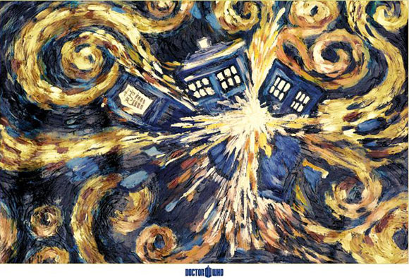
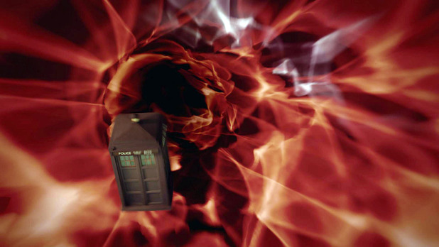
But also the scene where Rose, having looked into the heart of the Tardis is all shiny and full of Tardis knowledge (s1 ep 10 "The parting of the ways")
Rose Bad Wolf empowered by looking into the Tardis (from S1Ep10 The parting of ways)

I was a bit frustrated by failing to find an image of Rose looking like this with more than just her head and shoulders in view. But I don't think I'm missing any useful swirly-ness so never mind.

I also looked up for time vortexy pictures that were more yellow/reddish spectrum
Tardis in yellowish tinged time vortex Tardis in reddish tinged time vortext
But this was totally a retrospective justification.

Sorry about the pic spam but this is I'm afraid my creative process, stick with it.

When I started making the Tardis I had some technical challenges to stop the doors being too thick and the edges not fraying, so I cut a large blue ribbon in half and used the non fraying edge as the inside edge.

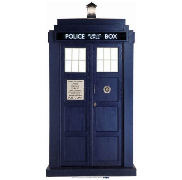
I also had to simplify the design as I began to see it was just too much to fit in all the details. To keep me relatively accurate, e.g notice on correct side, right number of panels, I used more images as reference:
Tardis on set with Matt Smith and Karen Gillan looks like a scene from s5 ep 4 "Time of Angels"Official Tardis standee

By this point I'm sure you're begging me to show you the darned sewing!! So OK, I'll give you something alright?

Early stage of letter T - Letter T in yellow is pinned on and the Tardis and contents are starting to be attached.
 Mostly at this point it looked messy. To keep the brightness of the yellow ribbon I had to put on two layers of ribbon : pale yellow under bright yellow. At this point I thought I'd test out my Picsart app's draw on a photo thingy and make sure the red towel would work, plus see how giving the Tardis a white outline to make it pop a bit would work.

There was obviously a lot of tidying to do and slight adjustments. One of which was the realisation that the top bar of the T had got too high and when placed correctly would come very low over the Tardis, So after some debate I put the Tardis lamp OVER the letter T.

T is for Tardis and always knowing where your towel is, Tardis doors closed
I also decided that the towel would flap freely below the railing. And what about the inside of the Tardis?
T is for Tardis and always knowing where your towel is, Tardis doors open showing the golden time swirl and towel lifted to show it flaps
Swirly space spiral! I had debated having black stars but decided they might not be clear what they were and look like weird dots or odd shapes. All in all it came out pretty darned well.

But what about the Towel? What's that all about?


Ah my dears, nerd fails on your part. This is a Douglas Adams Hitch Hiker's Guide to the Galaxy reference. One should always know where one's towel is. At all times.

Monday 30 September 2013

G[r]eek Alphabet - it's not over....and won't be just yet BUT

....I'm sure you'd like a summary post so you don't have to wade through everything to find the letter you are after. So I'm going to repeat the links to design post and then list the links to posts about letters in progress.

Updated pretty much finalised designs for all the letters

Making the letters


A is for Athena - completed and finished. (no before shots)
B is for Big Bird - includes early stage of creation and completed (same page as completed A)
C is for Cheshire cat - includes general talk on colour decisions and stages of creation
D is for Dalek
E is for Elmo
F is for flamingoes and feegles
G is for Ghostbusters

H is for Heracles
I is for Icarus
J is for Jam
K is for Kraken
L is for Luggage
M is for Medusa
N is for Narcissus
O is for Odin
P is for Pomegranate and Persephone
Q is for Queens
R is for R2D2
S is for stars
T is for towels and Tardises
U is for unicorns
V is for vampire
W is for Wonder Woman
X is for Xena warrior princess
Y is for Yggdrasil
Z is for Zaphod Beeblebrox

Thursday 26 September 2013

G[r]eek Alphabet - what next?

Well obviously T comes next and this is where you come in. I am hoping to make the Tardis doors openable and I am wondering what to put behind it. Before you get all excited let me 'splain something to you:

T for Tardis and Towel design with Cm tape measure for scale. Tardis is about 8.5cm tall T for Tardis and Towel design with inches tape measure for scale. Tardis is about 3 inches tall


Yes, you are seeing right, this Tardis is approximately 8.5cm tall with doors just under 6cm the whole gap left by the open doors will be 3cm. Or for refuseniks of metric life. The Tardis is just under 3 and a half inches tall total, with doors just over 2 inches tall and the maximum opening will be just over an inch.

However much you beg me to put TEN(nant) in there it's just not going to happen. Consider. The Queens sans crowns are about 5.5cm tall. It would be too much of a squish.

One friend has suggested stars. I had thought perhaps maybe a golden yellowishness and a vague impression of the console.

I did consider making a hole through to the other side and bridging it with gauze. BUT and it's a big but, the letter isn't designed to be held up, it's designed to be on the wall with velcro, while they are removable, looking through doors at the beigey offwhite back is not all that exciting or endless.

Thoughts? Let me know! I haven't started yet. I'm resting on my laurels.

In other news, I took a picture of the stack of letters the other day.

All my alphabet letters stacked up ready for the next stage
It looks amazingly large and rather small at the same time. Keep on moving! Or something!!