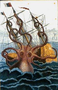
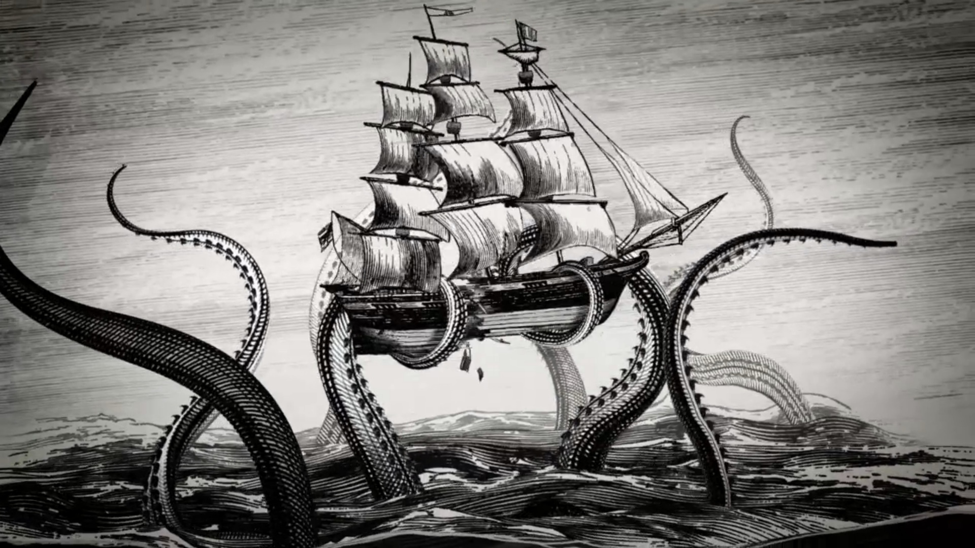
It's really handy right now when I want to tell you what images I was using as colour and design references while making the Kraken image. I am slightly mystified by the few friends on there that I follow constantly repinning pictures of food but it's all good really.
Anyway, the basic colour of the square was a dark streaky blue and I'd decided on a high contrast white ribbon for the letter.
I had a vague idea about pink for the kraken as it seemed somewhat octopus or squid like colour to use. The googled images I ended up saving for reference were :


I had decided to do the kraken limbs using embroidery and I was originally planning to do them very simply just in perhaps varying tones of pink with a bit of purple to separate them out and differentiate.
I had done most of the tentacles when I started to feel just a bit of purple to outline was not enough and the tentacles were looking a bit like weird worms rather than kraken tentacles. I had also just used varying shade and some very light purple as outline in places so I added more darker purple over the top to create definition
I also went back to the reference images to think about adding suckers. They seem to make the undersides and suckers lighter but I wanted something more visible and contrasting so I found a dark pink that I thought would work. I'm a little nervous about them but I think they look good.
Finally just to give a small touch of water I added a few wavy vees.
Although I love how this has turned out, because the more embroidery you do the harder it is to add on more over the top, and because an amazing friend had given me a ton of ribbon, I did wish afterwards that I had used cloth or ribbon for the tentacles as it would have been so much easier but as it came out so well I don't really mind! Looking forward to L which is a rather simple design with a little twist I'm planning.


No comments:
Post a Comment