Sunday, 18 August 2013

G[r]eek Alphabet - J to L

Three letters at a time is slow going!

J is for Jam

“The rule is, jam tomorrow and jam yesterday-but never jam today"
"It must come sometime to jam today", Alice objected
"No it can't" said the
[White] Queen, "It's jam every other day. Today isn't any other day, you know”
Lewis Carroll, Alice in Wonderland
Original sketch
Original sketch for geeky letter J for Jam
New sketch
New sketch for geeky letter J for Jam
I did have one other option for J - Jedi but how does one draw "jedi". I could draw a light saber, I could draw Luke Skywalker, but the concept of "jedi" is hard to put on paper so I had to ignore it both times. I did originally start out with a smaller jam jar but I wanted to write "yesterday" and "tomorrow" on the label so it had to be larger.

K is for Kraken

Original sketch
Original sketch for geeky letter K for Kraken
New sketch
New sketch for geeky letter K for Kraken
Other suggestions were K9 and knight but somehow I didn't fancy them and I liked the idea of the kraken.

L is for luggage

Original sketch
New sketch
To be precise the luggage from Terry Pratchett's wizard books. I don't think he's in the non-Rincewind stories but perhaps he is. I did consider Light sabers and Loki as you can see from the original sketch and notes, but the Mum herself asked for luggage when I offered and light sabers are more interesting in film and tv than on a static drawing or collage.
Fan art of Pratchett's character the living luggage
This image also appealed to me
More fan art of Pratchett's character the living luggage
My current plan is to make the lid of the luggage a flap and have a flappy tongue as well.

Saturday, 17 August 2013

G[r]eek Alphabet - G to I - high speed redux (updated 18 August)

Right I should really go sleep (yes I know I do do that a lot)
I'm going to quickly just post some images for  G to I (original sketches and some new sketches) and add some links to images I need right now for the letter Y - the world tree Yggdrasil

[[updated with extra info as per 18 August]]

G is for Ghostbusters

Original sketch
Original sketch for geeky letter G for Ghostbusters
New sketch
New sketch for geeky letter G for Ghostbusters

H is for Heracles....and maybe Horus?

Original sketch
Original sketch of Heracles (based on a famous statue of him, part of plans for letter H in geek alphabet
New sketch
New sketch for geeky letter H with Heracles
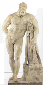
My original thought was to depict Heracles (the Greek name for Hercules - sorry I'm pro-Greek myths so always call him Heracles) based on a famous marble statue of him - particularly this statue:
The marble statue of Farnese Hercules of the Archaeological Museum of Naples
But when I started working on a new sketch in the right size, I felt I'd rather have him to one side.

What about Horus? Well as I began to sketch my final-ish sketches for the alphabet, I'd got stuck on the letter R and thought of including the symbol for Ra (ancient Egyptian sun god). Like any lazy person out there I googled for the symbol for Ra and came up with this :
Only there's a slight hitch, my Dad has learn ancient Egyptian hieroglyphs and this symbol is the eye of HORUS,  which does mean the sun, as Horus is the sky god, but  not actually the symbol for Ra. In fact I think google is mixing up sci fi tv show Stargate's use of the symbol (from the looks of the URL for this image) and the real ancient hieroglyphics.

The actual symbol for Ra is a circle with a dot in the middle

Hieroglyph for Ra - sun god of Ancient Egyptian mythology

Or it can be drawn as circle with a snake round it. So because it is a fun symbol I'm thinking of incorporating the eye of Horus into the letter H, but I'm dithering because I like the layout of the design as it stands

I is for Icarus

Original sketch
Original sketch for geeky letter I for Icarus
New sketch
New sketch for geeky letter I including Icarus

There's no real change here, although I am thinking of changing it slightly when I move to the final version. I want Icarus to be slightly lower down and further away from the edge of the square.

Yggdrasil, considerations and the final designs

As you may guess by my need for reference links and pictures for this, I have not yet finished my designs for the whole alphabet, and I have only got as far as Y.

One of the other things occuring to me is if there is an imbalance of male and females shown. So far I have got the following split

Men :
Odin (O), Heracles (H), Icarus(I), Feegle (F), [Narcissus but only as a daffodil]

Women :
Athena (A), Medusa (M), Red and White Queen (Q), Wonderwoman(W) [Callisto but only as a constellation of stars]

I did have Persephone but I only had her back foot and skirt, something that as you will see has not survived to the final design, and Medusa's face is hidden. The trouble is Persephone is not very distinctive to draw, a woman in Greek style dress is not very special looking. Well with W updated to be wonderwoman and adapting Medusa to show her face I think I feel content about the balance. More on "W" later.

Useful articles on Yggdrasil
Wikipedia article
Encyclopaedia Mythica article
Pretty picture I like
Tattoo design of Yggdrasil

G[r]eek Alphabet - D to F

So finally some new letters!

D is for Dalek

Original sketch
Original sketch for geeky letter D with a dalek
New sketch
New sketch for geeky letter D with a dalek
I'm still struggling with how to draw a decent dalek. I may resort to tracing. They're not easy to draw correctly! I ended up leaving out dwarves as they were fiddly to draw and sew and also I am trying to go for simple designs for easier construction.

E is for Elmo!

Original sketch
Original sketch for geeky letter E including Elmo
New sketch
New sketch for geeky letter E including Elmo
OK so confession time - I had some help from an artist colleague who can really draw to make my Elmo into a more Elmo like picture. Some of the problems with Elmo, as with dwarves and later feegles is that part of their characteristics is their small size. With no scale but the letter it's hard to give the impression of small without making a very small picture which is hard to make and see. Fortunately Elmo is also red so I can at least do that.

I would have liked to do Elmer the patchwork elephant from David McKee's books but he has so many squares that it would be very fiddly to sew either as real patches (very small) or as embroidery, which would be equally tedious. Thus, it will just be Elmo, not his namelike Elephant friend.

F is for feegles and flamingoes (for playing croquet)

Original sketch
Original sketch for geeky letter F including feegles and flamingoes
New sketch
Original sketch for geeky letter F including feegles and flamingoes

I didn't have much I wanted to do here. I should at some point sketch the feegles features but they're going to be pretty rudimentary/simplified. I must remember the plaits that several depictions seem to include.
Illustration of a feegle

G[r]eek Alphabet - A - C updated

A is for Athena and Apples of the Hesperides

Original planning sketch
Original sketch for geeky letter A including Athena and apple (of Hesperides)

New sketch
New sketch for geeky letter A including Athena and apple (of Hesperides)

As you can see nothing much has changed in this instance. The proportions and arrangement is slightly different, but nothing has really changed. It's just the square is larger than the page I was originally drawing on.

Sadly I'm still struggling with a way to incorporate the Great A'Tuin. No room in A or G or T....hmmm...maybe she can name her child a name with several As in it, then I can make some extra letter As.

B is for Big Bird and Books

Original planning sketch
Original sketch for geeky letter B including Big bird and books
New sketch
New sketch for geeky letter B including Big bird and books

Here also not much has changed, although I think I might do a little more work. Big Bird's face is nearly right but not quite there. Also I still want to include books, but my current placement works in pencil but will be fiddly to execute in cloth. Will have a think.

C is for the Cheshire Cat

Original planning sketches
First original sketch for geeky letter C including the Cheshire cat and the constellation of Ursa Major (the myth of the nymph Callisto)

Second original sketch for geeky letter C simplified with just the Cheshire cat and not the constellation
New sketch
Second original sketch for geeky letter C simplified with just the Cheshire cat and not the constellation
So you can see here that I chose the simpler design for the letter C. There were a variety of factors but I want these letters to have some clarity to them and be easy to read. Also I have some great ideas about ways to make it look like the Cheshire cat is disappearing. I still want the stars in there somewhere and the constellation of Ursa Major/The Plough and its attached myth of Callisto will be referenced.

G[r]eek alphabet : A belated update

Apologies to those of you who were expecting an update and further initial sketches for my Geek/Greek Alphabet. Life intervened. The photos were taken but there were lots of distractions including:
  • a bazillion visits to school assemblies promoting libraries and the summer reading challenge
  • my annual Christian kids camp week's volunteering
    and then...
  • the actual school holiday and helping run the summer reading challenge. 
Plus I suddenly had rather more personal stuff happening and before you knew it, HELLO it's 17 August - a good two months and a half later.

The baby who will eventually get to see this is still yet to arrive and I figure the baby won't really be appreciating this for some time so if it's not ready for its arrival, what're you going to do?

So what am I going to do?

I'm going to continue to add posts about letters, combined with reference pictures from the internets, but for your delectation (or apathy, whichever comes first) I will include two different pictures - the initial sketch and some notes and thoughts alongside the developments....I hope to be sewing very very soon.

Other exciting news

My friends have been to a signing by Neil Gaiman and they are taking one of my Sandman plushies. More news when I have it!

Update!
Links to the update posts if you are interested in a specific letter design

A - C
D - F
G - I
J - L
M - O
P - R
S - U
V , W and Y
X and Z (also extra H and extra O design)


Sunday, 11 August 2013

Elvis on tour

I was asked to make a second dark suited Elvis. I made him in a hurry for a short deadline but the requester didn't end up picking him up in time. He's currently in transit to his new home.

There's not much to say about him in terms of making. I had not got much black fabric as I mentioned earlier so he's actually navy coloured not black like the last one.

Third Elvis, nearly finished except for sun glasses and cape and the top of the head is yet to be sewn up

You can also see I tried to do a more regular sparkly pattern as well as less after the requester felt he was a bit "Indian".

Elvis the third complete with sun glasses

Back view of Elvis to show the red cape off
It took a while for the requester to collect the plushie due to a variety of complications. So at one point while it stayed at my parents. During a house tidying session they tidied him away to the model of The Globe I made for GCSE art many moons ago. He also visited the office of the volunteering I did for a week this summer, from whence he went home with the admin officer who has promised to deliver Elvis on to the requestor....eventually.
Elvis plushie visits the Globe (model)
I've now done Elvis three times. I'm not sure I'll do it again. Here they all are :

Photos of all three Elvis plushies in white, black and navy blue

Previously :

The king has left the building ... but er not yet - Elvis in the classic white sparkly suit
Elvis is back - The first stage of making the second Elvis in a black suit
Elvis is leaving the building... again - Final stages of making the second Elvis in a black suit

Is Neil Gaiman really The Sandman?

According to a friend, also the housemate of the person who previously requested the Sandman, my plushie looks like Neil Gaimain. I suppose he is pale with straggly hair and wears a lot of black. But I can't imagine he goes barefoot or wears a black onesie.

Anyway apparently a second copy was required to donate to the man himself at a signing, so very much at the last minute I started making him. I didn't have the particular black I wanted for his body but fortunately with no time to spare I found I had enough of some black to be the body and to be the fabric under the hair.

 I was also out of white felt so after some debate and query with the requester I used some white fabric I had to hand which was slightly heavy but not too bad.

Making was remarkably easy considering I'd not made one for a while but I'm still searching for a better solution to fixing on the hair. Another friend suggested I should have sewn it into the top of the head seam. I guess I could but I'm not convinced yet.

Anyway. In order to get the hair right I basically cut it far longer than needed and then give it a hair cut. Before the haircut this is what it looks like:

"Rastagaiman" Sandman plushie pre haircut and prior to the jacket being completed.

I then cut the hair the way I want it. I'm not sure I got the coat's proportions right but I did use the same pattern as alwys.

Then all that's left is the photo - in this case I felt like being arty and used some books as background. The one behind him is The Book Thief by Marcus Zusak.


Completed second attempt at Sandman plushie


If you're interested this is a comparison picture showing the previous attempt at the Sandman:


Photo showing both versions of the Sandman plushie

Previously  : Dream a little dream