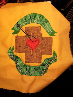
This last page has one of the simplest designs of the whole book both in terms of the details, but in terms of the shapes being large and easy to appliqué... well mostly. I had a debate about whether to cut out and hem down the shape of the ribbons or use actual ribbon. In the end I decided I would use actual ribbon. Folding the ribbon and pinning it in place to the right shape is fiddly but not so annoying as hemming curving shapes can sometimes be.
The design of the cross is based on the
Dehonian cross I first saw when I went to World Youth Day in Madrid with a Dehonian group.
I had fun creating a wooden pattern on the cross. before adding on the heart.
Once I added the writing in white, I felt like the writing didn't stand out enough. so I decided to add shading in black.
With that the design was done.
Now all that's left is the cover!


No comments:
Post a Comment