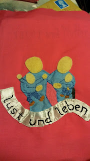
Unlike page 5 which was very much intended as a portrait, this page was only sort of a portrait in my mind, but ultimately that's what drove the decision making. It is a sort of family portrait, this mean that despite my design having the mother figure with a fringe, that disappeared during execution.
I also made an effort to change the face shapes to be a little more similar. The children are less portrait attempts as attempts to make children look like children.
From page to cloth also varies other aspects. In a line drawing in pencil you can get away with a general sketched shape for the combined bodies of both parents, but once you put down the appliqué it made the two parents look a little odd - not just huge but wrong shaped blob combined body.
So I redrew the bodies of both parents on the reverse and then filled in the bit in between with embroidery. I also found that having them top to toe in one colour blue just looked odd. So I chose some darker colours for the trousers and filled these in with embroidery as well.
I did debate putting the upper words onto a second ribbon but due to the transparency of the fabric the ribbon would have had to cover the original word placing which wasn't what I wanted to do so I stuck to the original design.
The final decision was to add white shadowing to the upper letters to make them stand out about.
I'm not entirely convinced by the "Dad" haircut, but overall I rather like the design. and how it came out.


No comments:
Post a Comment