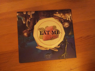
"You couldn't have it if you did want it," the Queen said. "The rule is, jam to-morrow and jam yesterday – but never jam to-day." Alice through the looking glass
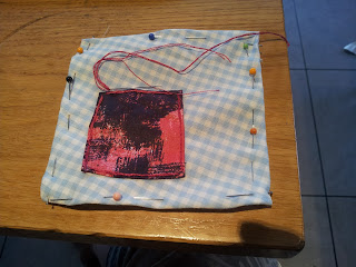
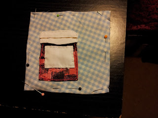
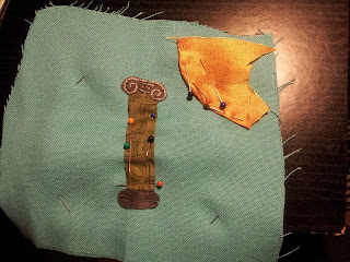
This was a relatively simple design which I could build up in straightforward layers. Because of the many pins on each layer, I sewed each layer down separately in order.
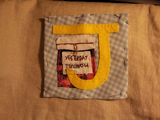
I started building up the layers before I had chosen the colour for the letter J although I had narrowed it down to yellow or green.
I chose this fabric for the jam jar because it is a mixed pattern as I liked the idea of the different colours as jam in a jar isn't normally just one plain colour.
When I came to finally choose the letter J I was still debating green but I took a small poll and they voted yellow. I'm afraid it wasn't a hard sell as I love yellow.
Final touch was the writing on the label. Yesterday went fine but tomorrow took some unpicking to get the letters to fit.
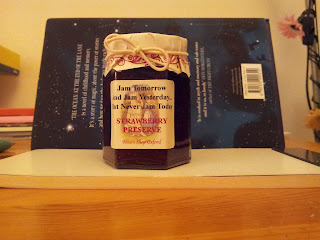
By chance some friends saw the following jam on sale and had to buy me one. Fab!
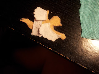
Also, an update on Icarus, votes were in and they said yes to feather details on the wings.
Here it is!
Wednesday, 11 September 2013
Sunday, 8 September 2013
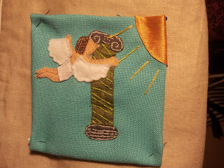
G[r]eek Alphabet : I is for Icarus and Ionic columns
I rather enjoyed this one even though parts were fiddly.
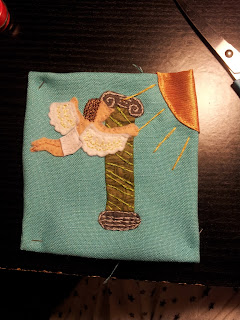
I wanted to be able to adjust the layout a bit so I decided I would make the whole of Icarus separately and then place him on the square-ish base. This also allowed me to adjust the letter I - which had now morphed into an ivy or plant covered column.
So then I placed the column for letter I and started the sewing down. I didn't want to do too much as I knew I was going to sew Icarus on top and I didn't want to make it too painful to sew through.
After I had sewn down Icarus - I used his hair sewing to sew down his head. I then added some spiral in green to sew down the column. This was part effect and partly I didn't have any green dark enough to sew it down semi invisibly.
So now I have one final debate. I had planned some extra feather detail on the wings. I remembered belatedly and then wondered if I should add it at all. I've started it in a very pale yellow. Is is a good addition or should I have left the wings without it?
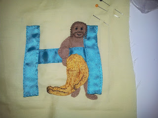
G[r]eek Alphabet : H is for Heracles
So yes, I'm that sort of classicist. Heracles not Hercules ;-)
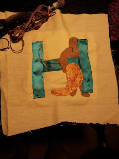
My first decision was that I decided that Heracles got a bit burnty and anyway he was Greek so why would he be all pale? So I got a stronger coloured felt for the flesh. Then I struggled with the colour of the lion. I really wanted this piece of fabric I thought my mum had which was furry. But sadly it has vanished. So I had to choose between some delish yellow satin from a friend or the same orangey stuff as the apple in A and cheshire cat in C. I decided on this finally
But then I needed a fabric for the letter H. I had originally thought of the fake brown leather like for letter A,
But looking at it together, it goes together almost too well, and wouldn't be distinguishable against Heracles himself.
I then debated a green ribbon which became my final choice.
For this letter I basically made all the pieces, then pinned them into place and started sewing down the top layer first. At this point I found that I should have made more of an overlap for the body behind the H an a right hand side foot. I added an extra bit of felt for the foot and I just had to continuously carefully adjust the ribbon position to keep the exactness of the cutting of the fabric as discreet as possible.
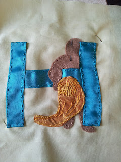
For the lion skin that Heracles wears but is mainly here as a modest prop I started out just giving it a mane and some folds.
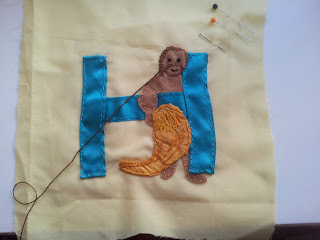
Having sewn the H down as well, and the body mostly I realised that as the cutting and layout had ended up, Heracles had more face hidden than my original design called for, which I didn't like. So I undid some of the stitching of the green ribbon to pull the head in front of the H. I then started sewing the hair followed by the eyes and mouth.
The hair colour turned out to be a bit light so I sewed some extra stitches in a darker colour. You can see it here where half the hair has only the light colour and half doesn't
Then I realised the lionskin looked a bit undefined so I added in a brown some leg and paw details.
And we're done. I'm faintly debating this one as a friend who is not so familiar with Greek myth wasn't sure what was depicted - she wondered if it was Jesus or a wrong colour Hulk!
I'm wondering about including a club but I like the design as is.
Wednesday, 4 September 2013
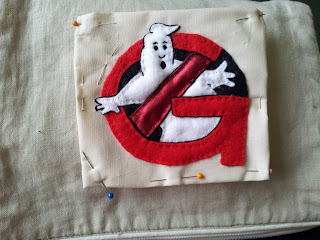
G[r]eek Alphabet : G is for Ghostbusters!
Ghostbusters!!!
This one was really quick but fiddly. I did debate using non felt cloth, but the fiddlyness put me off. Part of what made it fiddly is that white is quite transparent, which means I couldn't take the easy option and just build up layers as this would make the white go dull.
This left me with a sort of jigsaw puzzle specially as [retraction] I decided to use a satin for one part. Foolishly I had accidentally cut it on the bias which meant it refused to behave without umpteen pins. Unfortunately on this scale pins rather distort the fabric. As I don't have infinite hands and fingers it was the only option. You can see what I mean in this first picture.
Sewing down the cross piece dramatically reduced the pins (hooray!)
I also mostly sewed things down apart from the far edges and then tidied up my fabric cutting as that way I could see how much I could afford to trim. With everything sewn down, I had edged the parts of the ghost that came outside the circle to make them obvious, and to separate out the cross bar from the G. However, having done this it looked not quite right so I decided it all needed outlining in black.
For those of you interested, this is the back, where you can see I didn't quite manage to line up exactly with the plan but it more or less was the same shape and placement!
G[r]eek Alphabet : F is for flamingos and feegles!
You've seen most of the stages on this, so the last part was to work out what to do to define the chin and how to do the mouth. I even resorted to the computer to test some stuff out. Particularly as a red mouth just looked really dumb
Then my feegle expert said their defining hair thingy is they have a plaited split beard and why don't I use wool. Only I didn't have wool and it would have to be very fine to work at this scale. So I did it with embroidery thread.
It was hard work though as the threads were tiny and I should have cut them longer and then cut it off shorter.
So the feegle anatomy is a bit weird but it's all good. And I love my flamingo.
Friday, 30 August 2013
G[r]eek alphabet : F is in progress!
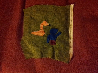
So what colour is a Feegle? What colour is his kilt? And what kind of beak does a Flamingo have? These are some of the many questions I ask myself when making things.
I had some pale felt, lotsa turquoisy fabric like the back of letter A, and navy and various patterned fabric in various shades and some dark royal blue. I really wasn't sure so I consulted a friend who loves Pratchett and may have dressed as a kelda. She was bound to have a final view on the colour of woad that the feegles have tattooed every inch of skin with. She voted royal blue. Which was cool as I also liked it, but difficult cos it frays really easily, specially on a small piece of fabric. I didn't have an orange for the hair I liked so that was going to be embroidery.
I dithered about the kilt as I didn't have any real tartan but then I found THIS picture
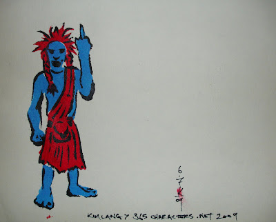
and thought YES! Reddish would work, specially as I'm going to have a red letter F.
Here's a picture of the first layer sewn down.
Sorry it's dark but my phone is amping the yellow. The flamingo is pinker than that.
So then I have to place the F before I can finish the flamingo (so I don't embroider bits you won't see). I also need to do the hair and legs on the feegle.
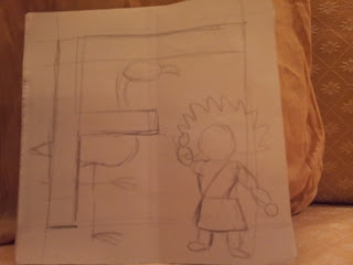
The most observant might realise - I've accidentally cut out the feegle the wrong way round - the original drawing had the other arm waving.
But I'm not too fussed about it.
So then I have a slight hitch when I test pin the F ribbon. The small bar of the middle of the F is hiding a lot of flamingo. And this is starting to look crowded even without the feegle's hair and legs.
In theory all my letter designs use equal-ish sized bars for all parts of each letter, but I'm not bound to it, each letter square is its own thing as far as I'm concerned. I just like some consistency-ish-ness (yes that's a word, I made it up right now so I know!).
Here's a temp look at what that might mean. Yup I think it's going to have to be halved.
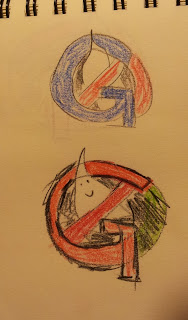
This top half shows the problem if I keep the whole of the Ghostbusters logo and the G and keep them both red. It's hard to read the G.
The bottom half saw me try making the G green. Not a bad solution but not quite there.
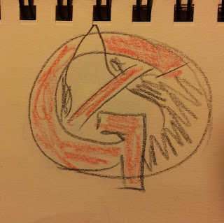
So then I tried it in blue, also a bust (see top of the next sketch page. So I thought about using the contrast colour on the bit between the start and end of the G's semi circle.
Then my friend says - why not leave that bit of the logo out. And, to make the G separate from the cross bar, have a thick black line round part of the G.
And voila! Problem solved. Should be a quickie too as I'm going all felty on that one I think.
All this makes me realise the art debt to my family. My embroidery thread collection is I suppose you could say an inheritance from my grandmother. Embroidery was something I did for her too to make a gift - antimacassars. Sewing is something my mum still does, although no applique, mostly skirts and jackets.
And my Dad? My Dad does full size sketches of his paintings, then transfers them onto the white boards he paints on.
He also does colour sketches to work out colour combinations and balances. Sometimes as a kid he'd let me suggest colours and show me how they could look.
I guess I learn a lot and they weren't even teaching me.
Dear family, I love you a lot, even the deceased members.
I had some pale felt, lotsa turquoisy fabric like the back of letter A, and navy and various patterned fabric in various shades and some dark royal blue. I really wasn't sure so I consulted a friend who loves Pratchett and may have dressed as a kelda. She was bound to have a final view on the colour of woad that the feegles have tattooed every inch of skin with. She voted royal blue. Which was cool as I also liked it, but difficult cos it frays really easily, specially on a small piece of fabric. I didn't have an orange for the hair I liked so that was going to be embroidery.
I dithered about the kilt as I didn't have any real tartan but then I found THIS picture

and thought YES! Reddish would work, specially as I'm going to have a red letter F.
Here's a picture of the first layer sewn down.
Sorry it's dark but my phone is amping the yellow. The flamingo is pinker than that.
So then I have to place the F before I can finish the flamingo (so I don't embroider bits you won't see). I also need to do the hair and legs on the feegle.
The most observant might realise - I've accidentally cut out the feegle the wrong way round - the original drawing had the other arm waving.
But I'm not too fussed about it.
So then I have a slight hitch when I test pin the F ribbon. The small bar of the middle of the F is hiding a lot of flamingo. And this is starting to look crowded even without the feegle's hair and legs.
In theory all my letter designs use equal-ish sized bars for all parts of each letter, but I'm not bound to it, each letter square is its own thing as far as I'm concerned. I just like some consistency-ish-ness (yes that's a word, I made it up right now so I know!).
Here's a temp look at what that might mean. Yup I think it's going to have to be halved.
And what about G for Ghostbusters?
I did some colour sketches as I couldn't work out how to make the letter G clear and keep the Ghostbusters logo combo. Since I was at work I got two opinions and found a solution!This top half shows the problem if I keep the whole of the Ghostbusters logo and the G and keep them both red. It's hard to read the G.
The bottom half saw me try making the G green. Not a bad solution but not quite there.
So then I tried it in blue, also a bust (see top of the next sketch page. So I thought about using the contrast colour on the bit between the start and end of the G's semi circle.
Then my friend says - why not leave that bit of the logo out. And, to make the G separate from the cross bar, have a thick black line round part of the G.
And voila! Problem solved. Should be a quickie too as I'm going all felty on that one I think.
All this makes me realise the art debt to my family. My embroidery thread collection is I suppose you could say an inheritance from my grandmother. Embroidery was something I did for her too to make a gift - antimacassars. Sewing is something my mum still does, although no applique, mostly skirts and jackets.
And my Dad? My Dad does full size sketches of his paintings, then transfers them onto the white boards he paints on.
He also does colour sketches to work out colour combinations and balances. Sometimes as a kid he'd let me suggest colours and show me how they could look.
I guess I learn a lot and they weren't even teaching me.
Dear family, I love you a lot, even the deceased members.
Thursday, 29 August 2013
G[r]eek Alphabet : E is for Elmo!
Elmo has to be one of the easiest letters to do. I could I suppose have chosen to make him out of woven cloth rather than felt but in this case, with him being a fuzzy character it seemed like a good fit to have him made of felt, rather than a lazy cop out.
It went by very easily. I did debate the nose colour a bit, firstly I'd forgotten what colour it is.
This was my reference image for that.
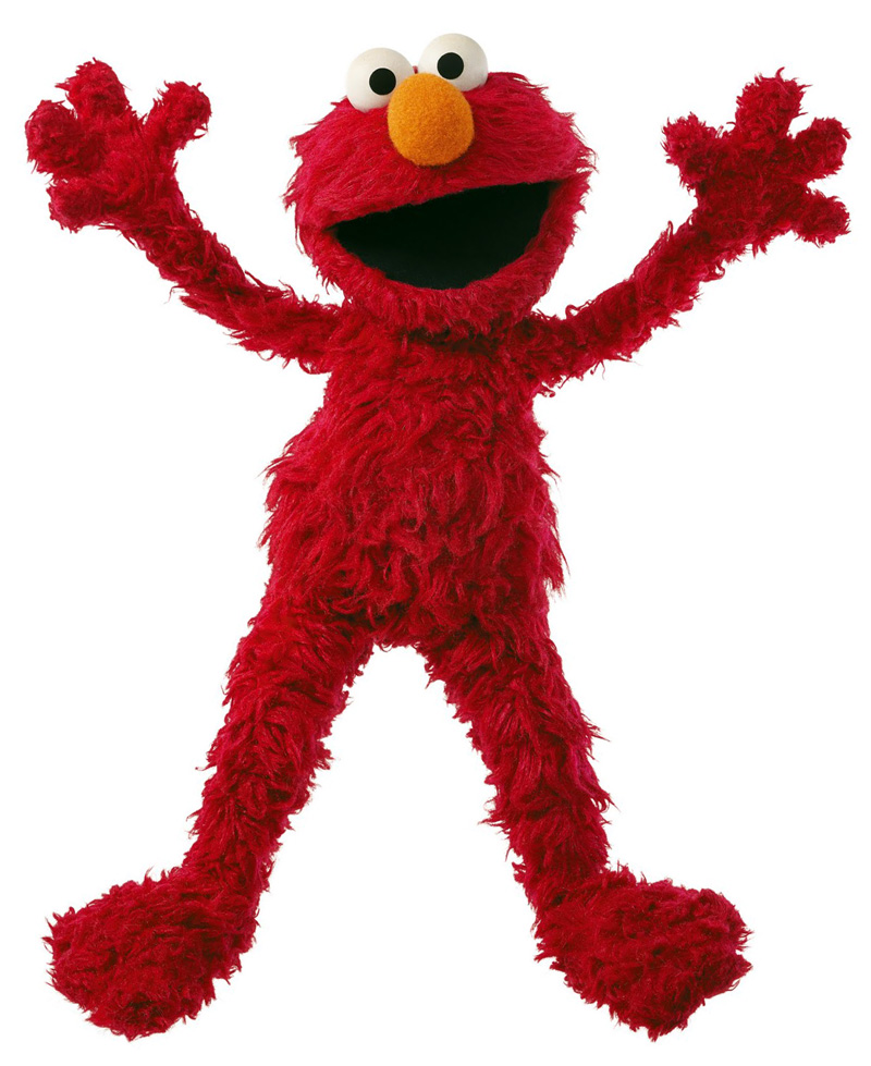
But because the background is orangey yellow, and his nose is orangey yellow I was worried it would make a hole through the image and tried various yellows paler or less red, but in the end orangey yellow was the best colour so I went ahead.
I struggled a bit with the embroidery on the eyes because I did rather tiny white stitches and then did the black over the top which made it difficult to sew through to make the eyes.
But all in all it worked out great and was over too quick to really stop and take photos of the stages.
I'm now on to cloth choices for F!!! Which means we're on to the second row full throttle!!
It went by very easily. I did debate the nose colour a bit, firstly I'd forgotten what colour it is.
This was my reference image for that.

But because the background is orangey yellow, and his nose is orangey yellow I was worried it would make a hole through the image and tried various yellows paler or less red, but in the end orangey yellow was the best colour so I went ahead.
I struggled a bit with the embroidery on the eyes because I did rather tiny white stitches and then did the black over the top which made it difficult to sew through to make the eyes.
But all in all it worked out great and was over too quick to really stop and take photos of the stages.
I'm now on to cloth choices for F!!! Which means we're on to the second row full throttle!!
Subscribe to:
Posts (Atom)
