I may have been slightly tipsy when I started work on this page, and this may have been the cause of my initial mistake, although to be honest I'm entirely capable of making a mistake without combining alcohol and sewing.
I chose red for the basic colour of this page because it reminded me of theatres I've been to. I'm not sure which one in particular but somehow it said "theatre" to me.
First thing was to sew down the large white area of the box office, then I sewed down the head of the ticket seller and the mouse attending the opera.
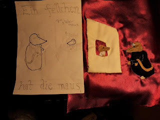
This is when I made my big mistake, I placed the body of the mouse on the sheet from the front thinking I'd got it right or maybe I placed it while flipping from back to front, who knows now, I was tipsy, and I sewed down at high speed the furcoat of the mouse attending the opera. Having finished, I flipped over to see the following : the furcoat was on upside down.
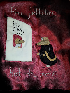
Any sensible person would have undone the stitching and placed it again. I'm not that sensible, I'm also very lazy and fortunately for me the mouse's head was roughly equidistant from the top and the bottom meaning, as you can see below, the end result was the design ended up a mirror image of itself.
The only pain was resituating the writing on the reverse. Really all in all it was not a disaster, and although sometimes the design is meant to face a certain way, this isn't one of those designs. You may note that the words ticket office have disappeared, this is because it was just too small and I felt it was pretty obvious what was going on.
Photographing this page was its own challenge which I have not entirely solved. The fabric is satin-y. It means it reflects light all oddly when photographed in a way your eyes don't find problematic.
This photo is far too dark
This one, taken in daylight, has some areas more close to the real colour, but others are just not.
More pictures of more pages to come!


No comments:
Post a Comment