So howzat working out for ya? Two very nice SF references in ONE square of fabric, I''ll admit I'm pretty pleased about it.
My first debate was as usual a colour one. My original colours for this square were :
Background : Navy blue (quite dark navy)
Tardis : Royal blue (slightly light one)
Towel : Pale blue
Letter T : Undecided
While the three blues all blended together they blended a little too well really for good visual clarity. I want these designs to be very straightforward to read, for a child to read. I want them to be able to see the letter and to see what the pictures are.
So I immediately thought I would bring in some bright colours, the towel became red felt, and the letter T became bright yellow. Admittedly this was also not a stretch for me, I love yellow and will take any excuse to wear it or use it.
The next thing I wanted to think about was related to some interactivity I had hoped and planned to add into this square. Most of the squares will be simple designs sewn on, but some of them I hoped I could add things that open or other aspects. I'd managed to add in an opening lid to the luggage already. Here I wanted to make the Tardis have openable doors. But if they doors are open, what is going to go inside them?
I sent out a distress signal on Facebook, Twitter and Blogger. I warned people of the spec. This is a very small space. Much as I'd like to put your favourite doctor, I'd be hard pressed to fit him in recognisably in a space
5.5cm x 3 cm.
Some of the serious and less serious suggestions were :
- Screwdriver (sonic one assumes)
- Tiny smurfs
- Fez
- Swirly time vortex
- Stars
- The baby's name in Gallifreyan
- Console room (which one)
- K9
- Doctor Who logo
- The word "run"
My favourite was probably the stars but to fill the inside of the Tardis with more dark in a design already having blue on dark blue I felt was not going to work. So instead I went with a golden colour.
I did debate doing a 10 or may be 11 style console room in part.


But ultimately there was just too much detail to be realised.
I also did debate the baby's name in Gallifreyan thingy. But I just didn't quite fancy it although learning Gallifreyan was quite fun.
Then I decided it would be spirally time vortexy. I was stuck with the yellow goldeny colour by this point. And I had a bunch of things that went through my head.
Not least the Van Gogh episode (s5 ep 10 "Vincent and the Doctor").

But also the scene where Rose, having looked into the heart of the Tardis is all shiny and full of Tardis knowledge (s1 ep 10 "The parting of the ways")

I was a bit frustrated by failing to find an image of Rose looking like this with more than just her head and shoulders in view. But I don't think I'm missing any useful swirly-ness so never mind.
I also looked up for time vortexy pictures that were more yellow/reddish spectrum


But this was totally a retrospective justification.
Sorry about the pic spam but this is I'm afraid my creative process, stick with it.
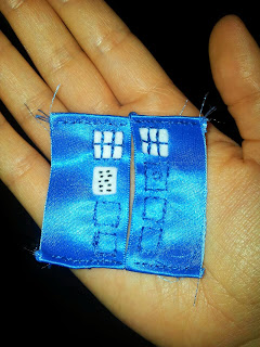
When I started making the Tardis I had some technical challenges to stop the doors being too thick and the edges not fraying, so I cut a large blue ribbon in half and used the non fraying edge as the inside edge.
I also had to simplify the design as I began to see it was just too much to fit in all the details. To keep me relatively accurate, e.g notice on correct side, right number of panels, I used more images as reference:


By this point I'm sure you're begging me to show you the darned sewing!! So OK, I'll give you something alright?
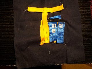
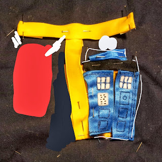
Mostly at this point it looked messy. To keep the brightness of the yellow ribbon I had to put on two layers of ribbon : pale yellow under bright yellow. At this point I thought I'd test out my Picsart app's draw on a photo thingy and make sure the red towel would work, plus see how giving the Tardis a white outline to make it pop a bit would work.
There was obviously a lot of tidying to do and slight adjustments. One of which was the realisation that the top bar of the T had got too high and when placed correctly would come very low over the Tardis, So after some debate I put the Tardis lamp OVER the letter T.
I also decided that the towel would flap freely below the railing. And what about the inside of the Tardis?
Swirly space spiral! I had debated having black stars but decided they might not be clear what they were and look like weird dots or odd shapes. All in all it came out pretty darned well.
But what about the Towel? What's that all about?
Ah my dears, nerd fails on your part. This is a
Douglas Adams Hitch Hiker's Guide to the Galaxy reference. One should always know where one's towel is. At all times.
